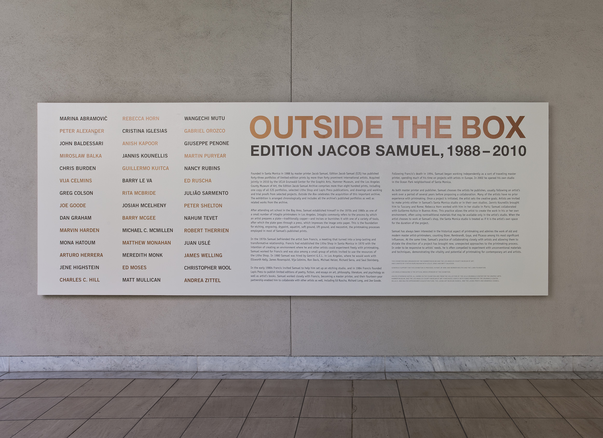
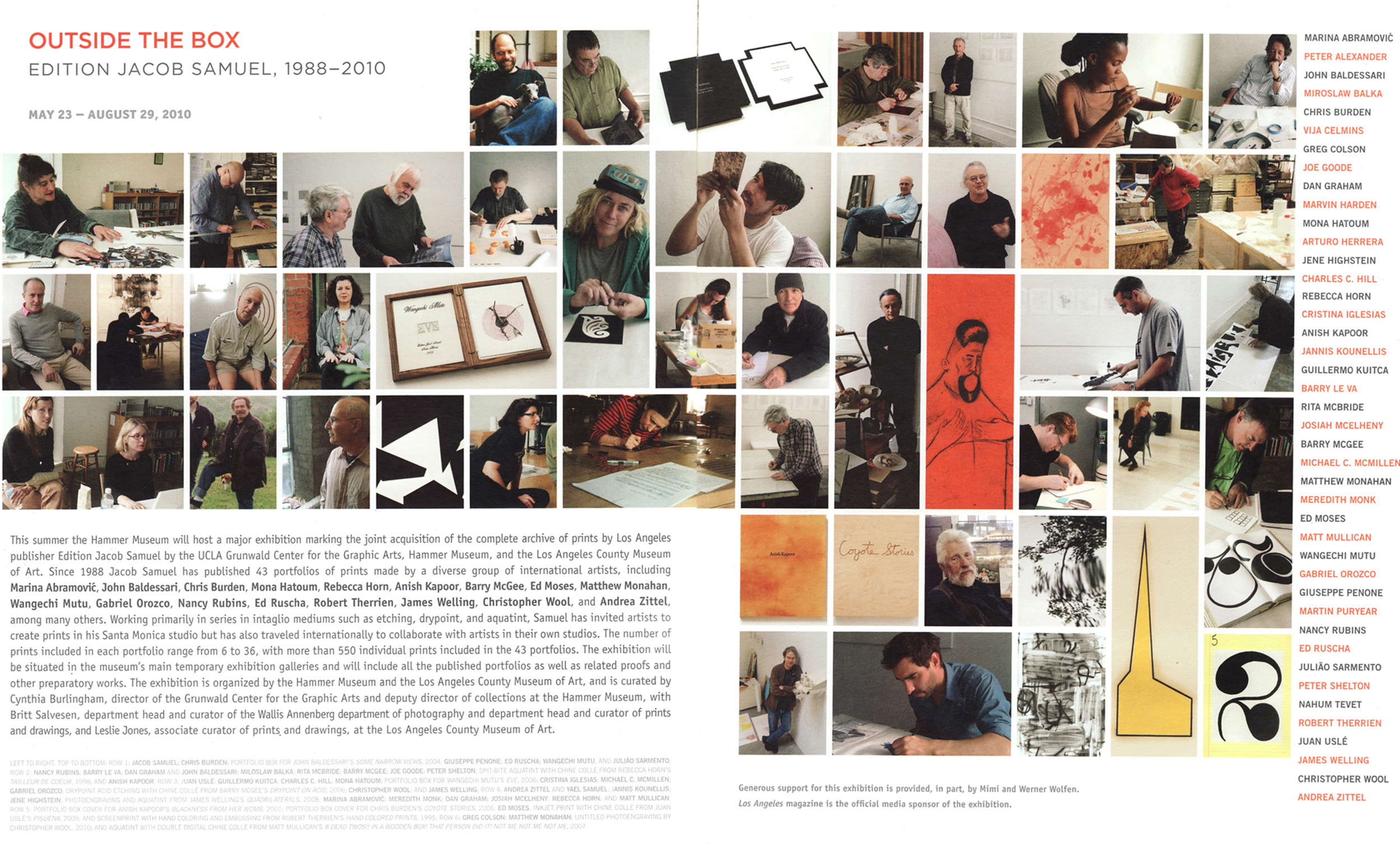
Following the joint acquisition of this portfolio by LACMA and the Hammer Museum, this exhibition celebrated printmaker and publisher Jacob Samuel and the world-class artists who collaborated with him from 1988 to 2010.
The design concept targeted to establish a calibrated framework to showcase the framed prints and portfolio cases as one complete output of Jacob Samuel while honoring the unique achievement of each featured artist.
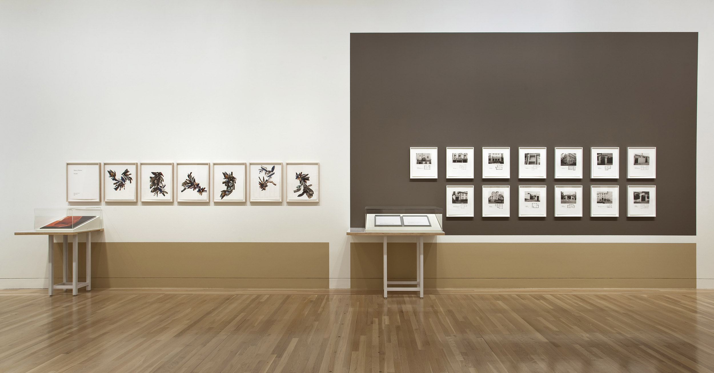

The main design trajectory came from the two formats of the exhibited works: framed prints on walls and portfolio cases displaying unframed prints and colophons. A careful consideration of the appropriate color background was established behind each series of prints to provide a neutral background of contrast or complement.
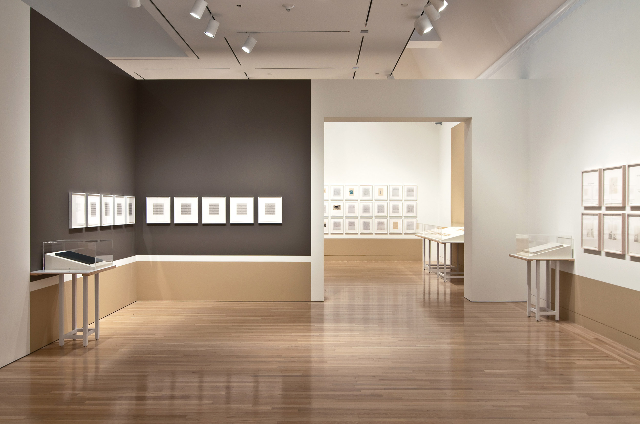
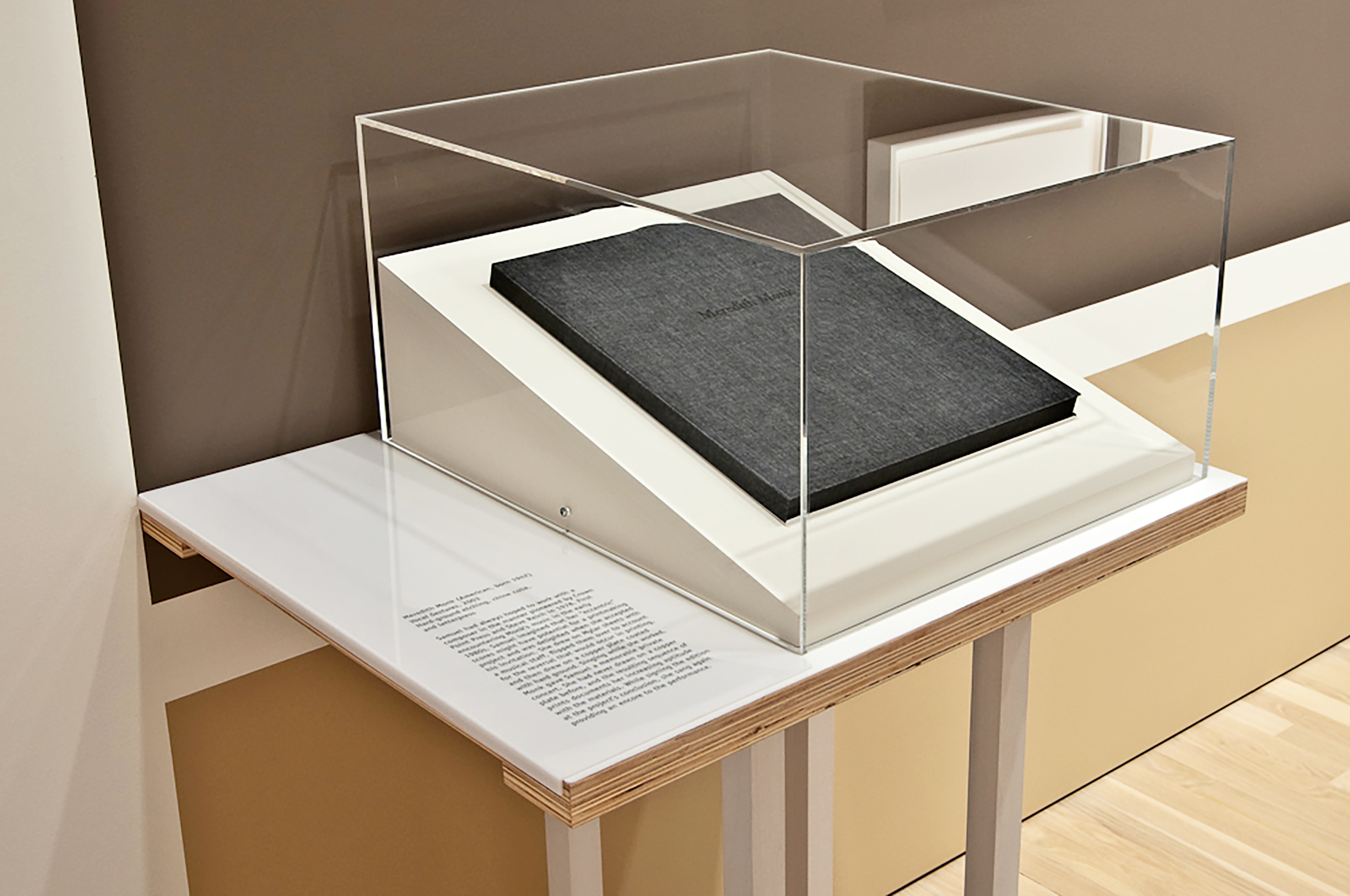
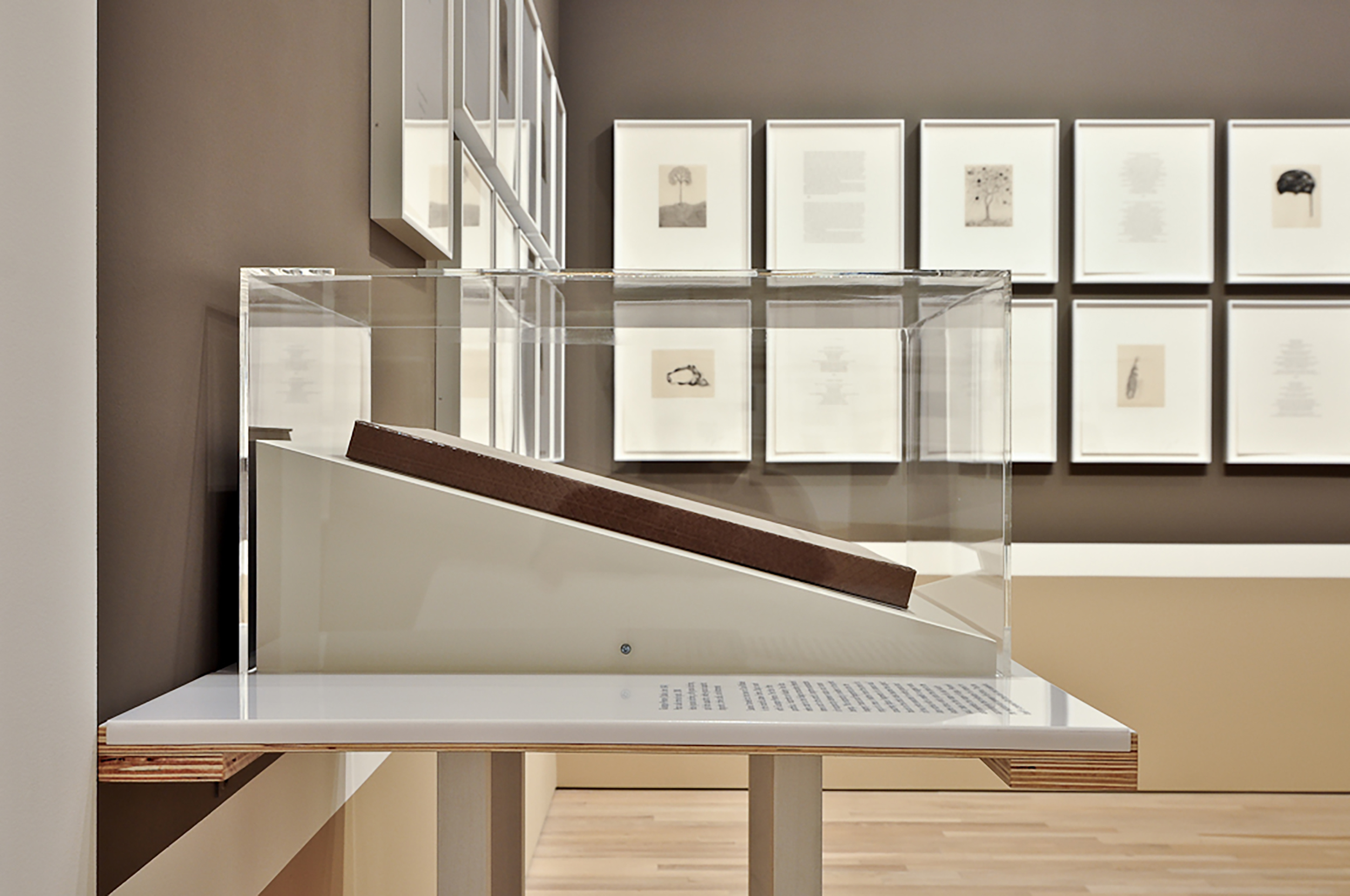

Color was deployed as both a spatial and an indexing device applied onto wall surfaces. Each group of prints by an individual artist was indexed by a rectangular ‘baseboard’ of paint similar to the color of the clear maple gallery floor. The height of the baseboard was set low enough to not interfere with the viewing of the work, yet high enough to create a spatial effect of a folded tab from the floor.
The width of the color tab was calibrated to enhance the recognition of pairing between the wall hung prints and the display furniture of the same artist. On occasion, the consistent indexing of the ‘baseboard’ color tab was punctuated by a dark saturated tone to support groups of wall hung framed prints above.
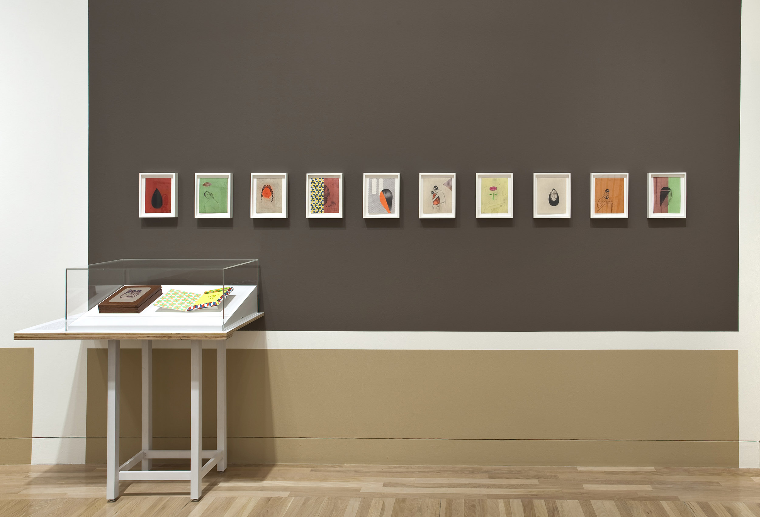

A rigorous research for three neutral background colors was conducted by working directly with a wide sampling of the prints. Two light neutrals (a nearly pure white and an off white) as well as a dark warm grey were used for the show. The saturated color was applied on the wall as a rectangle field of paint precisely spaced above the ‘baseboard’ color tab, creating accents throughout the exhibit.
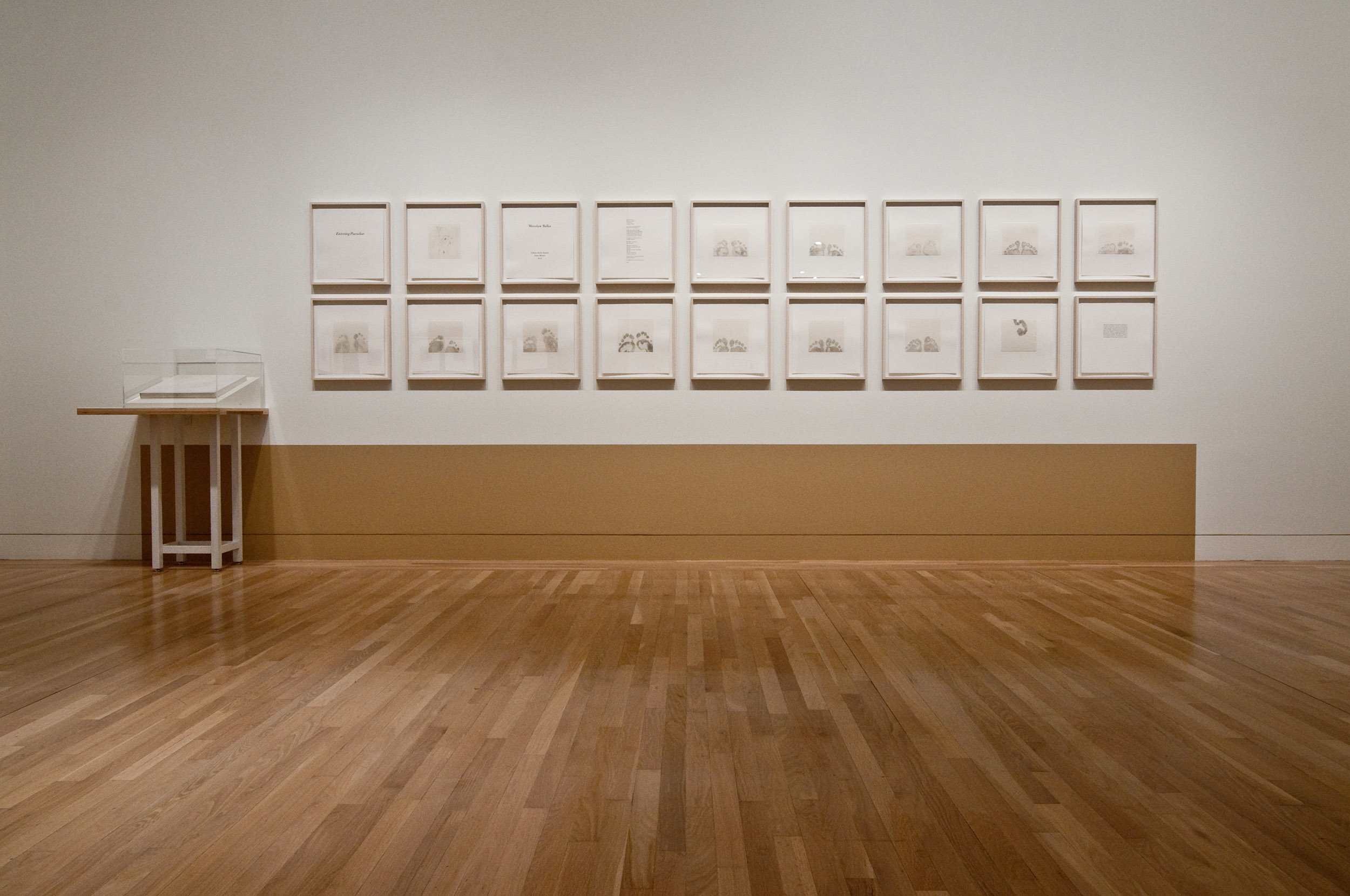
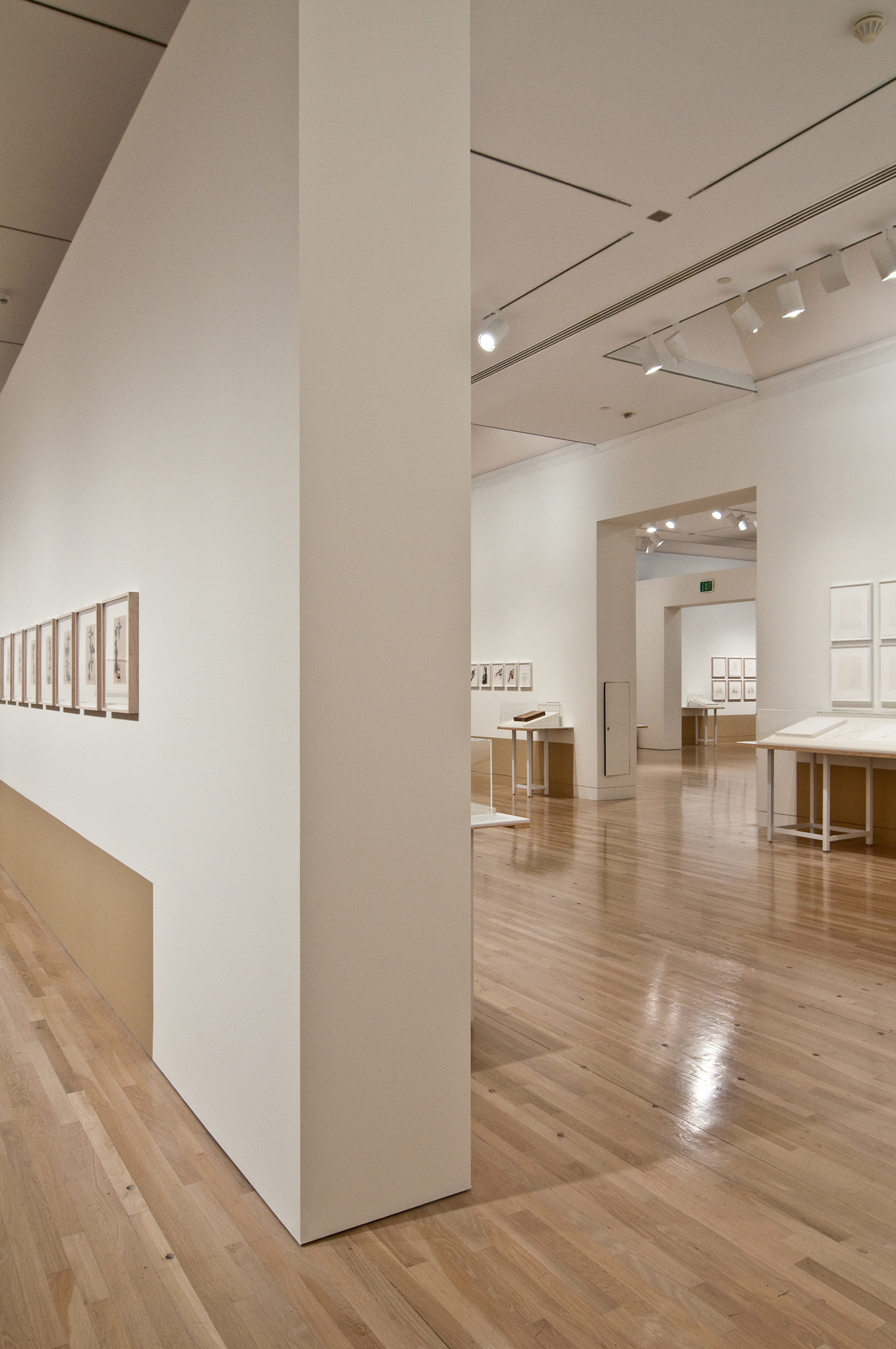
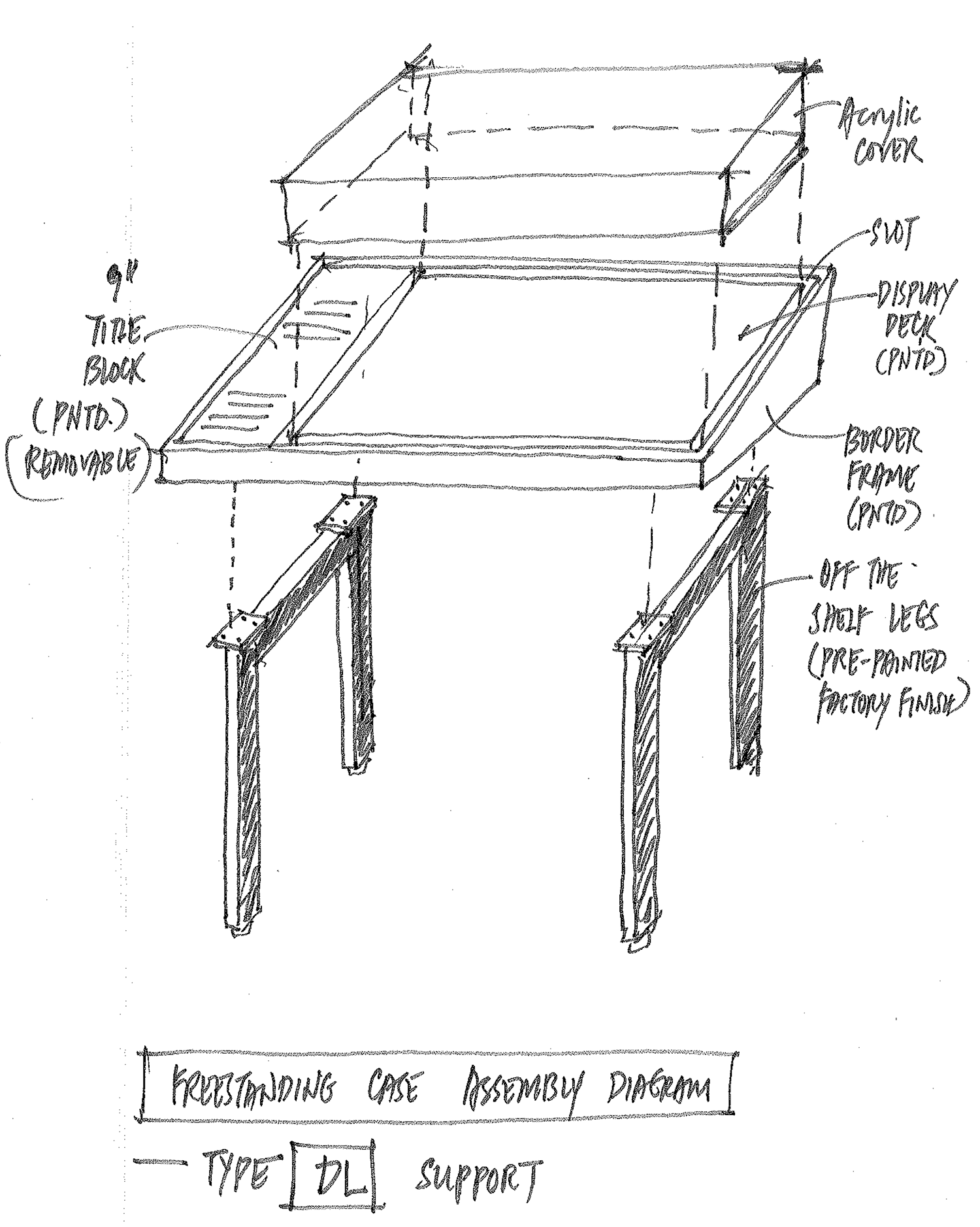
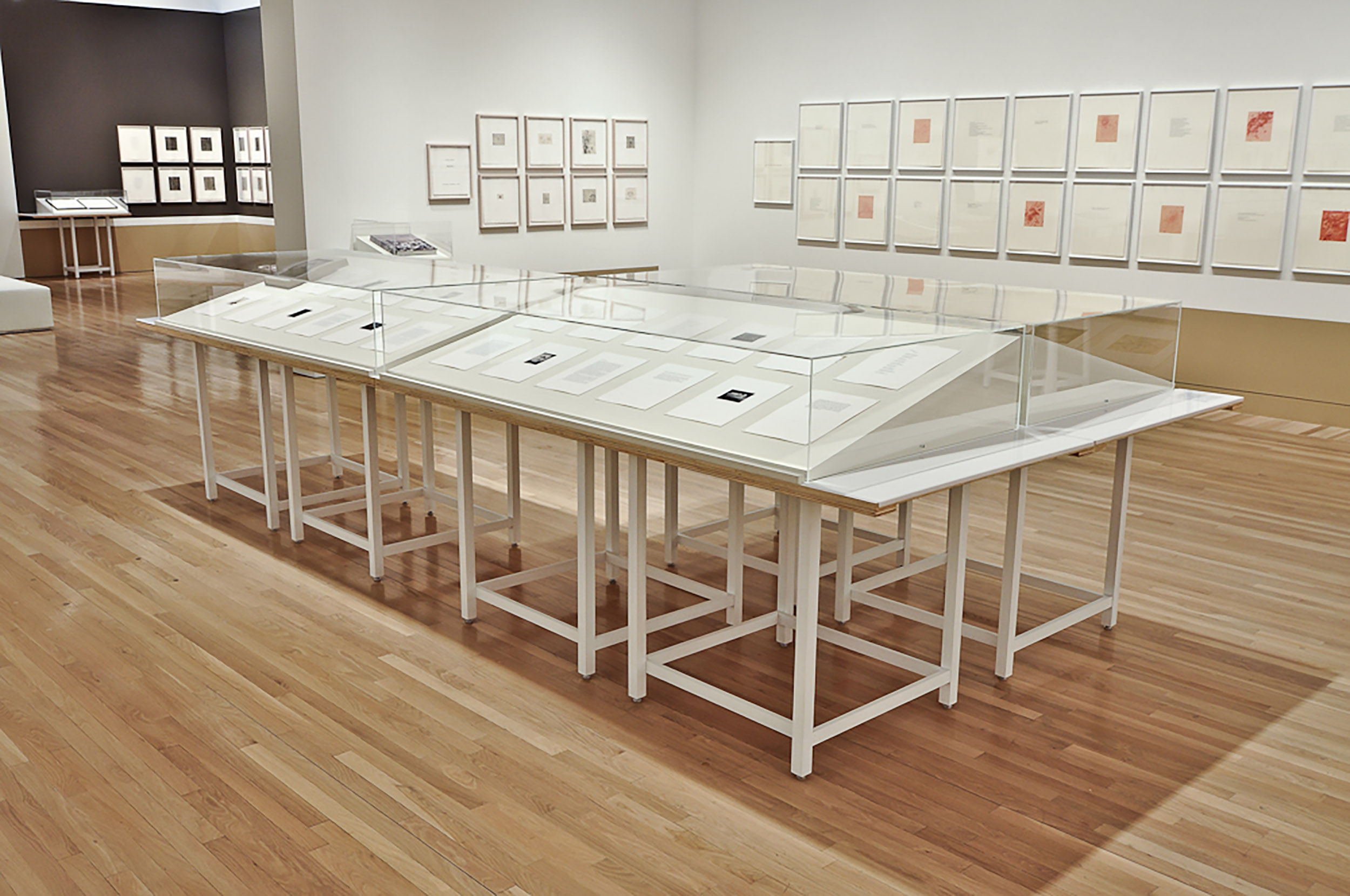
The display furniture was designed to recall an elemental table, lightly washed with white paint except for the exposed plywood edges. The abundance of legs established a rhythmic density below the visual periphery of the prints on the walls.

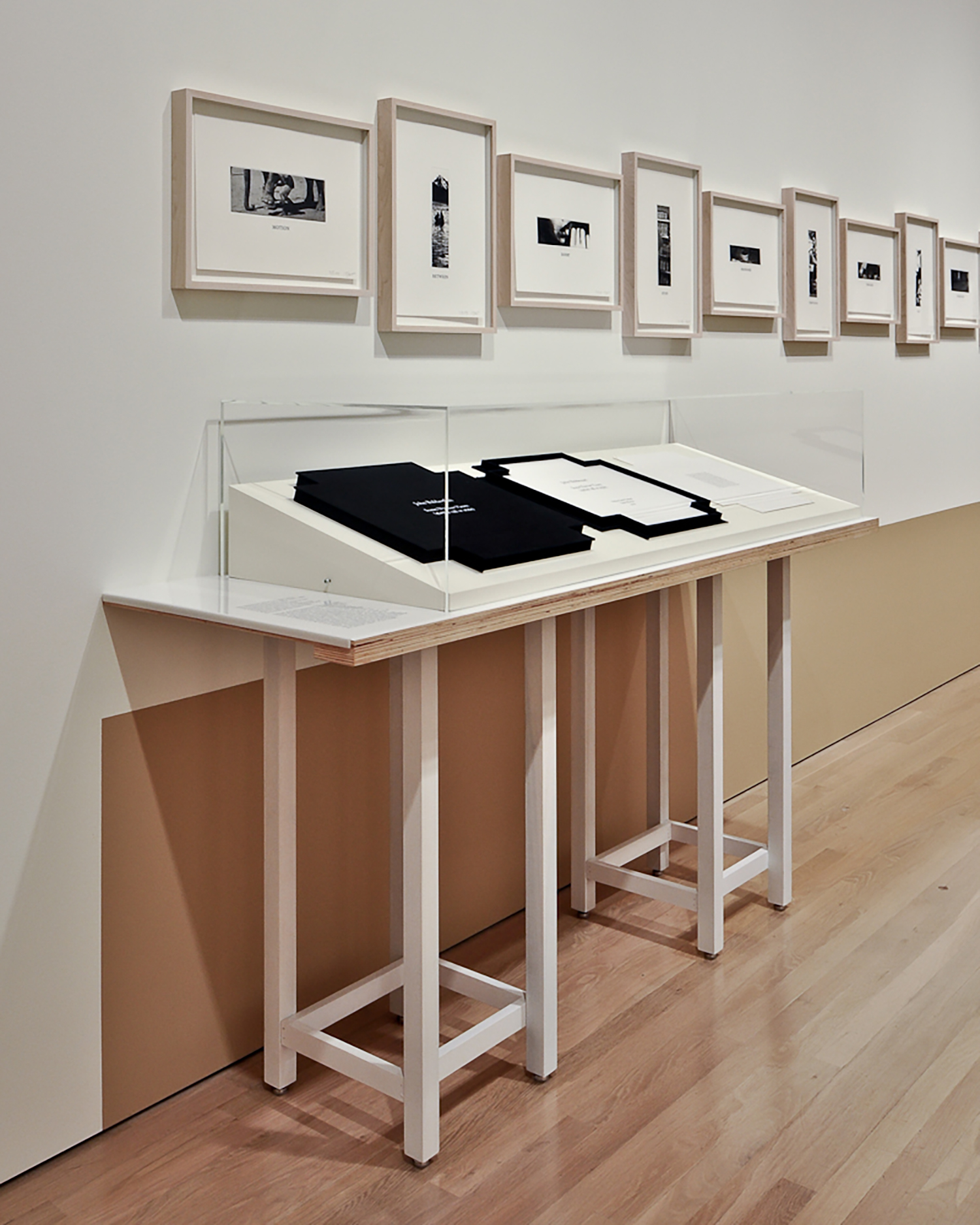
A neutral off-white display wedge was asymmetrically placed on the table surface and topped by an acrylic box. The effect recalled the unpacking of prints from a portfolio box set on a table.
On the edge of each table, an acrylic didactic label with one draped edge reiterated the indexing color tab motif and eliminated the need for any distracting wall labels.
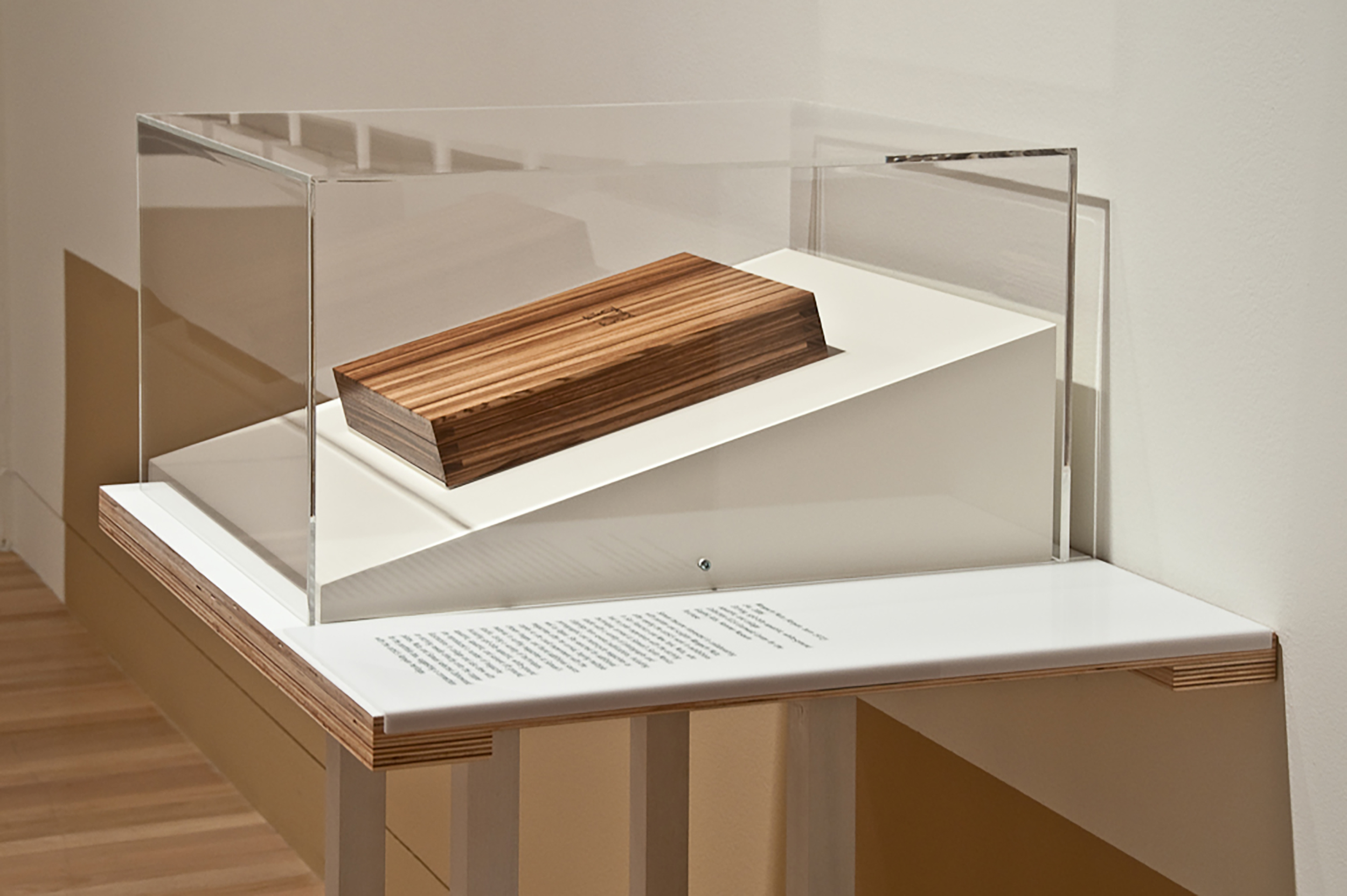
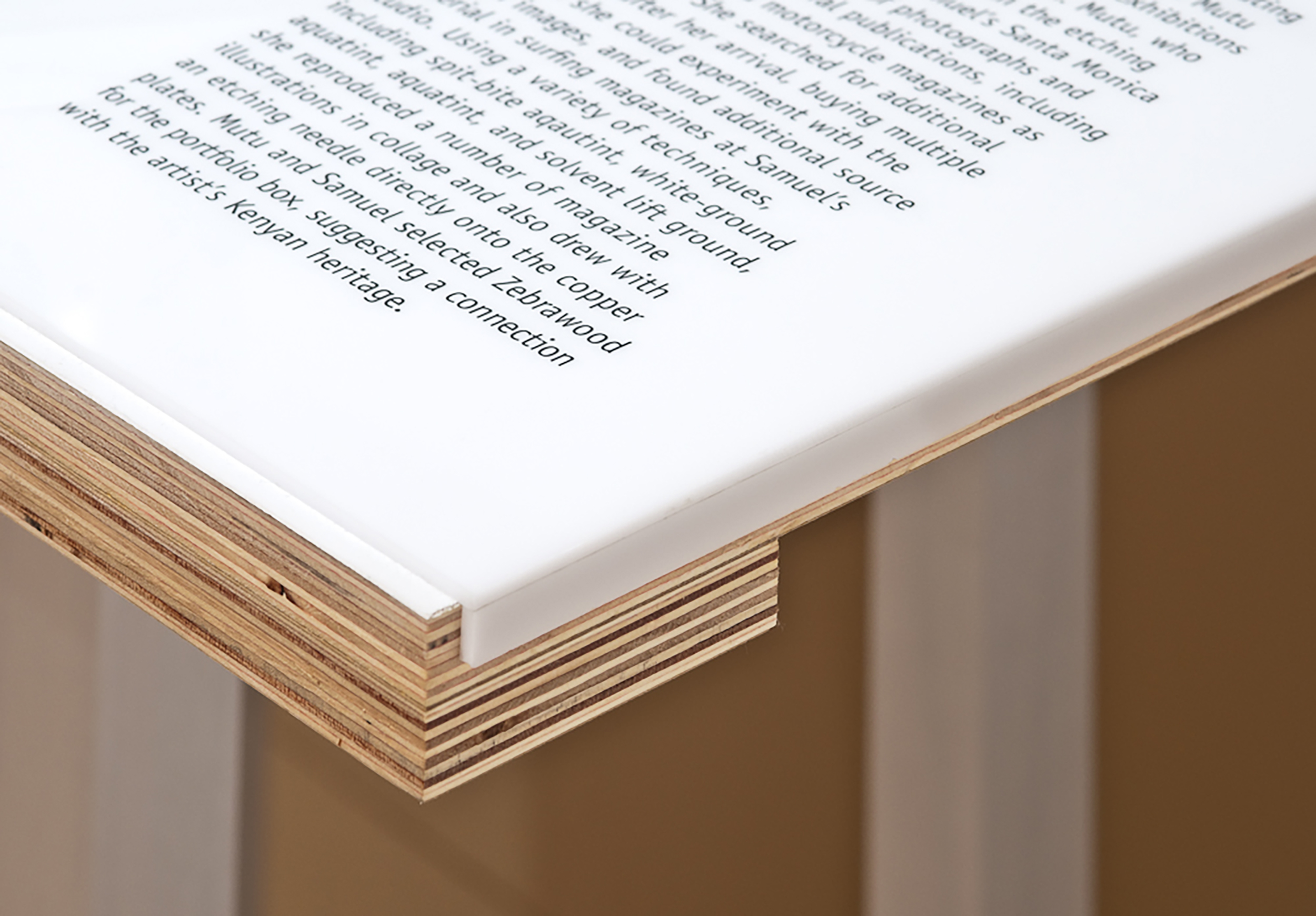
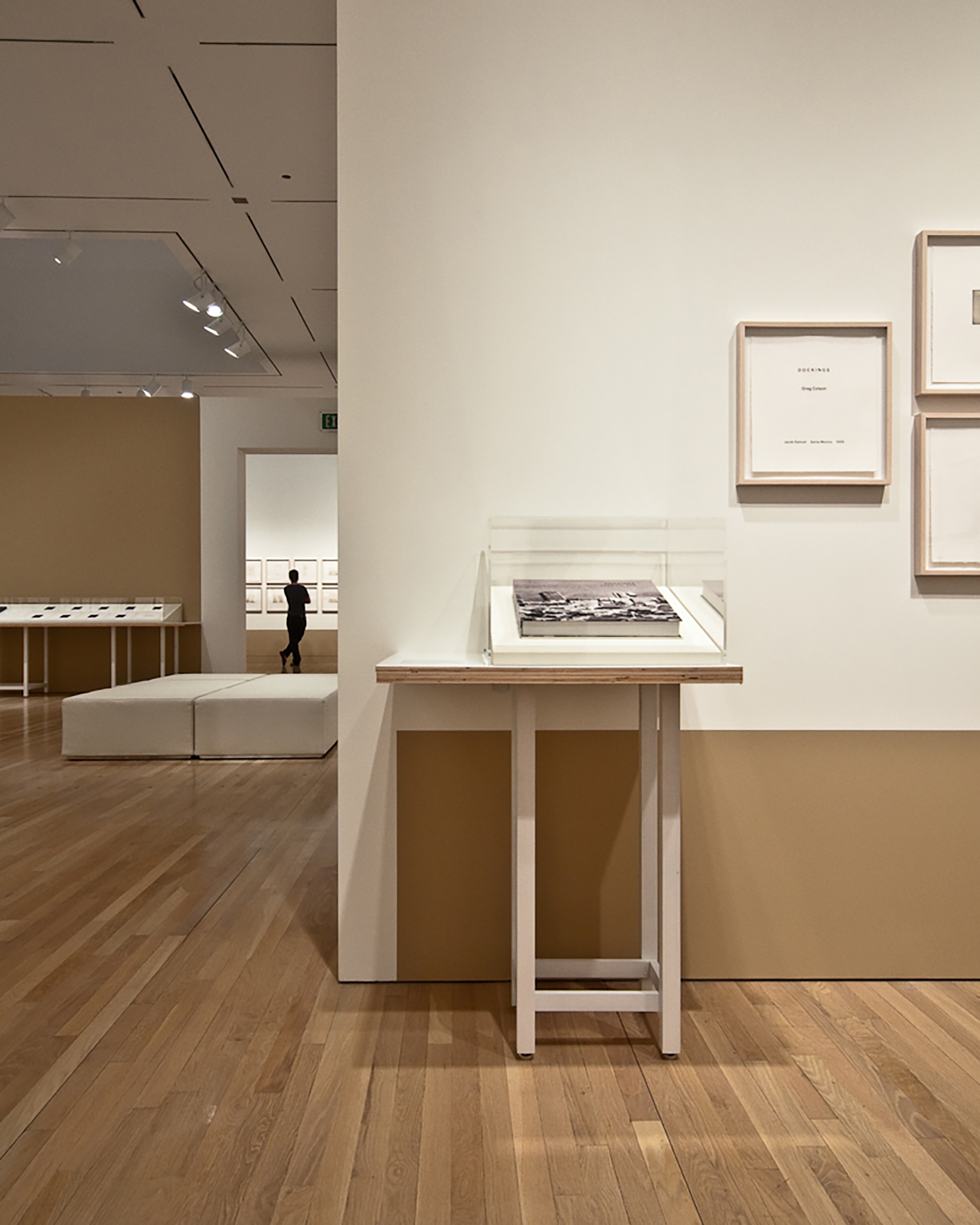
The calibration of color, proportion, placement and visual density created a calm and unifying atmosphere for the viewing of the body of work as a whole. The indexing device of color and display furniture helped the visitor to view the work of each artist as an autonomous experience.

Featured artists include Marina Abramovic, Peter Alexander, John Baldessari, Miroslaw Balka, Chris Burden, Vija Celmins, Greg Colson, Joe Goode, Dan Graham, Marvin Harden, Mona Hatoum, Arturo Herrera, Jene Highstein, Charles C. Hill, Rebecca Horn, Cristina Iglesias, Anish Kapoor, Jannis Kounellis, Guillermo Kuitca, Barry Le Va, Rita McBride, Josiah McElheny, Barry McGee, Michael C. McMillen, Matthew Monahan, Meredith Monk, Ed Moses, Matt Mullican, Wangechi Mutu, Gabriel Orozco, Giuseppe Penone, Martin Puryear, Nancy Rubins, Ed Ruscha, Juliao Sarmento, Peter Shelton, Nahum Tevet, Robert Therrien, Juan Usle, James Welling, Christopher Wool, and Andrea Zittel.